chinenyé ©26
Terranova
Architects environmental data you can walk through.
Video Walkthrough

It starts with a question no one else was asking: what if architects could feel the air before they built it?

Every rival tool does half the job: spatial or environmental, never both.

Businesses with beautiful walkthroughs with zero airflow data; parametric graphs with zero embodiment.

Three people would eventually stand in this space: the architect drowning in data, the engineer defending it, the client who just wants to believe it.

Air and light can't be perceived on a page, so decisions get made blind.

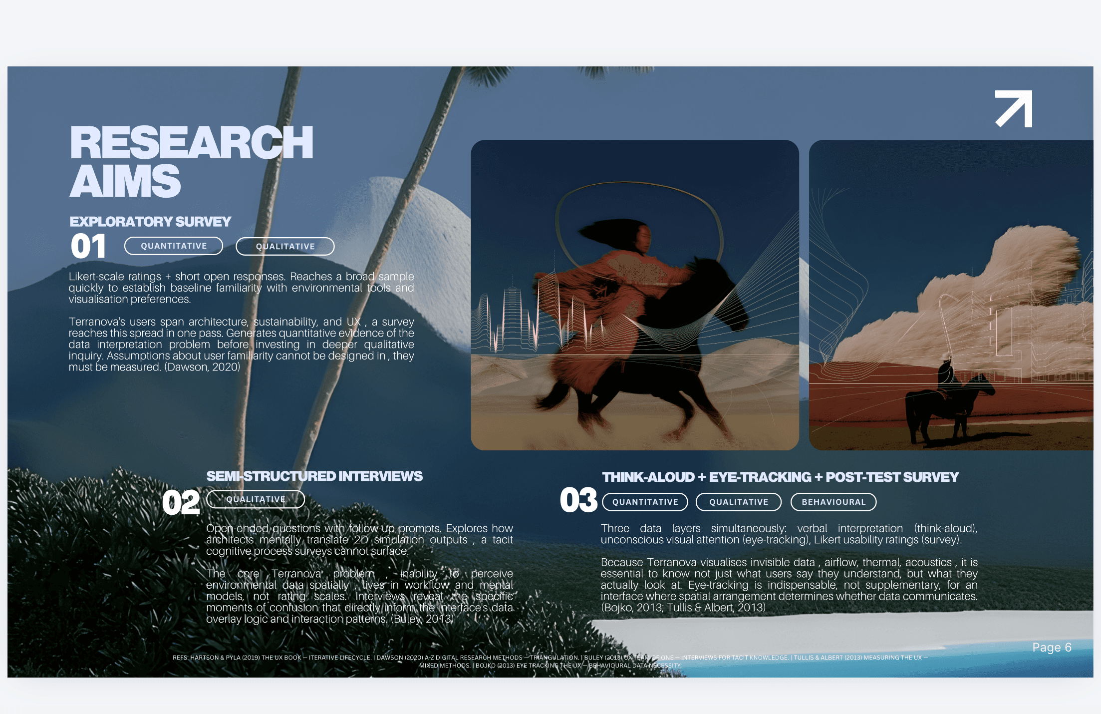
The interface visualises the invisible; the study does too , surfacing what architects can't tell you they're doing.

I mapped myself against the discipline and found my best work in the gaps between labels.

Nine design the building, six design the interface , and both ends of that were represented.

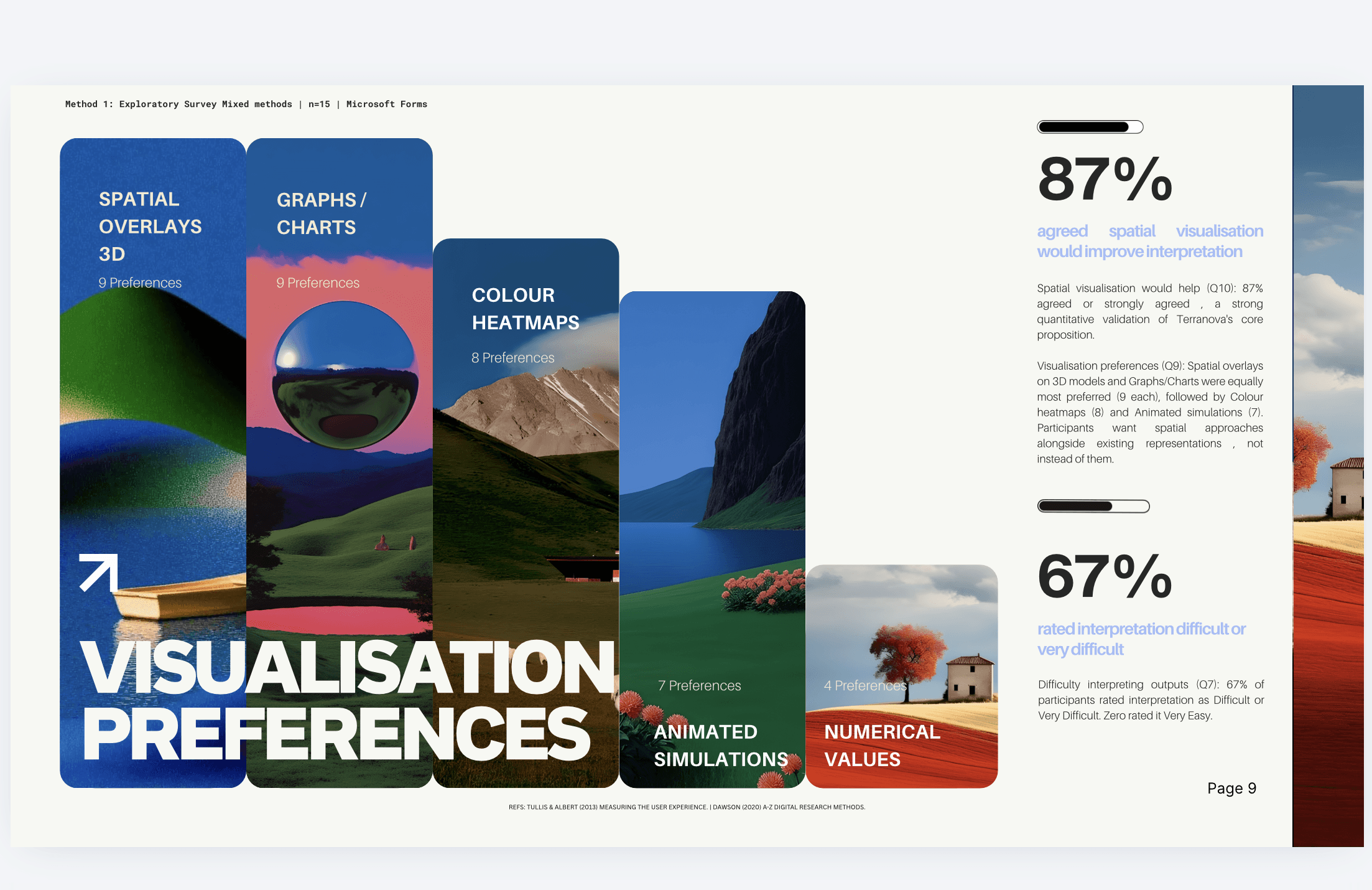
87% believe spatial would help. 67% already find interpretation hard. The gap between those is the product.

The friction isn't in the numbers. It's in the distance between the output and the space it describes.

Architects design first, check performance later. That's not a workflow. That's a warning sign.
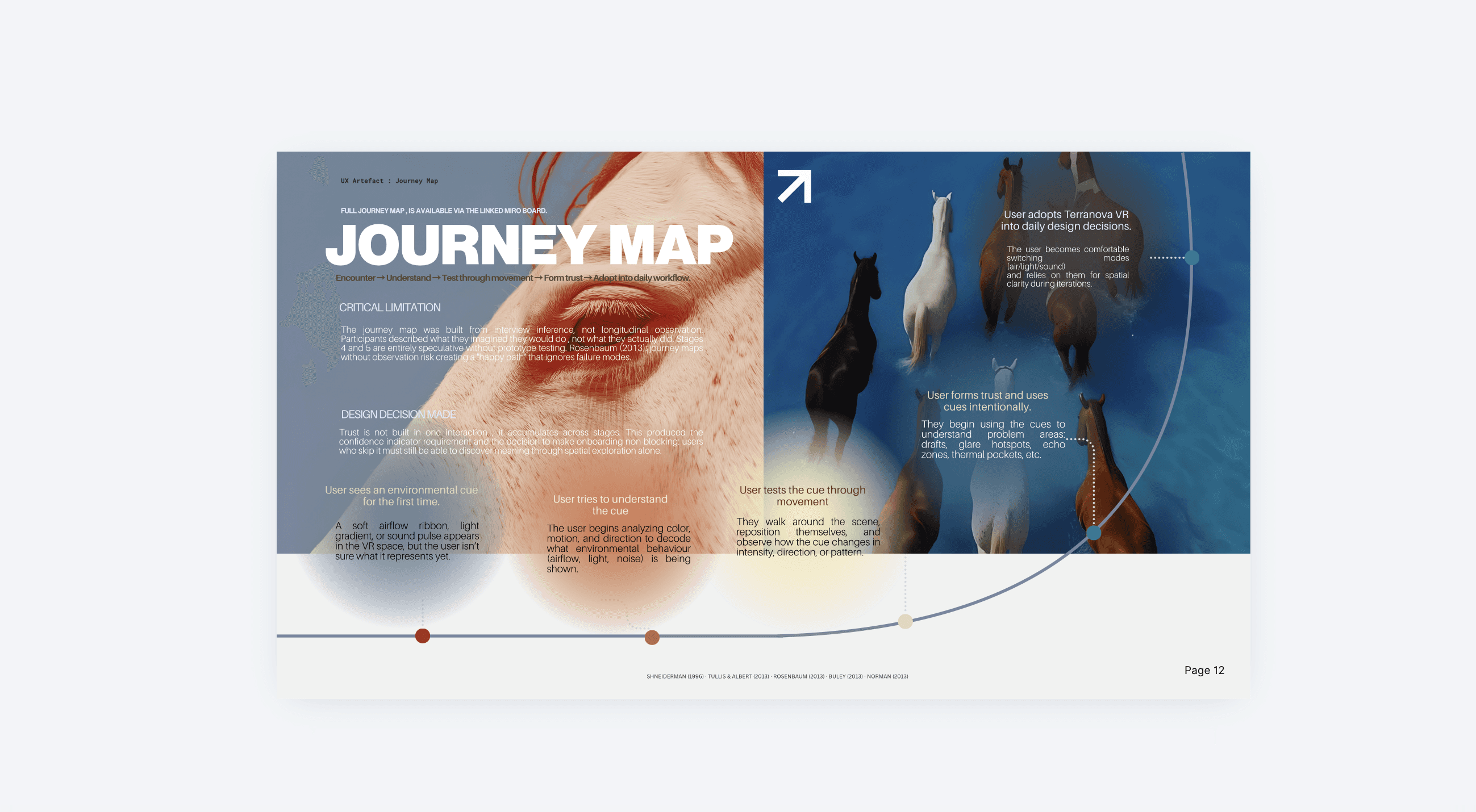
A user meets a cue they can't read, walks around it until it makes sense, and ends up fluent in three modes of environmental data.
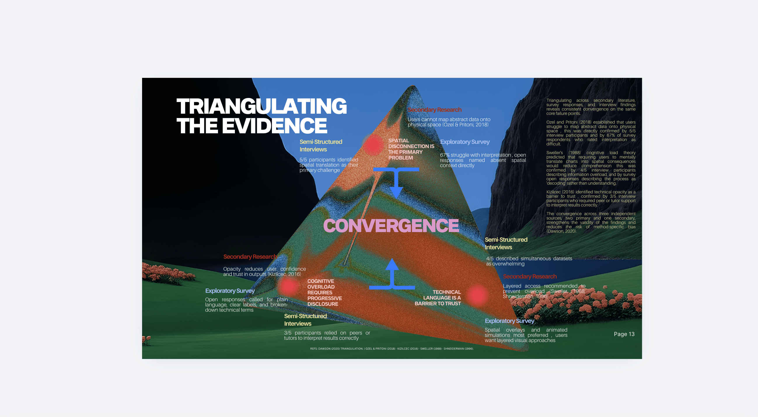
Three independent sources point at the same three failures, spatial disconnection, cognitive overload, and technical language as a barrier to trust.

"We usually design first, then check performance after" , the requirement is to break that order.


I sketched to find the order of operations, not the look. Layout comes later; sequence has to be right first.

This is where progressive disclosure stopped being a principle and became a checkbox group.


A design system derived from findings, not aesthetics , focal region hierarchy, layered disclosure, and spatially anchored data.

There's no dashboard here, only a sequence , the data doesn't sit on top of the space, it becomes it

Gaze captures where friction occurs, think aloud captures why, the survey quantifies what it cost.

Attention mapped to the overlays and the central canvas, not to peripheral navigation: the disclosure hierarchy held under test.

The 3D viewport and mode tabs dominated gaze , evidence the centralised workflow directed attention exactly where intended.

High fixation and low saccade rates indicate cognitive engagement rather than visual search.

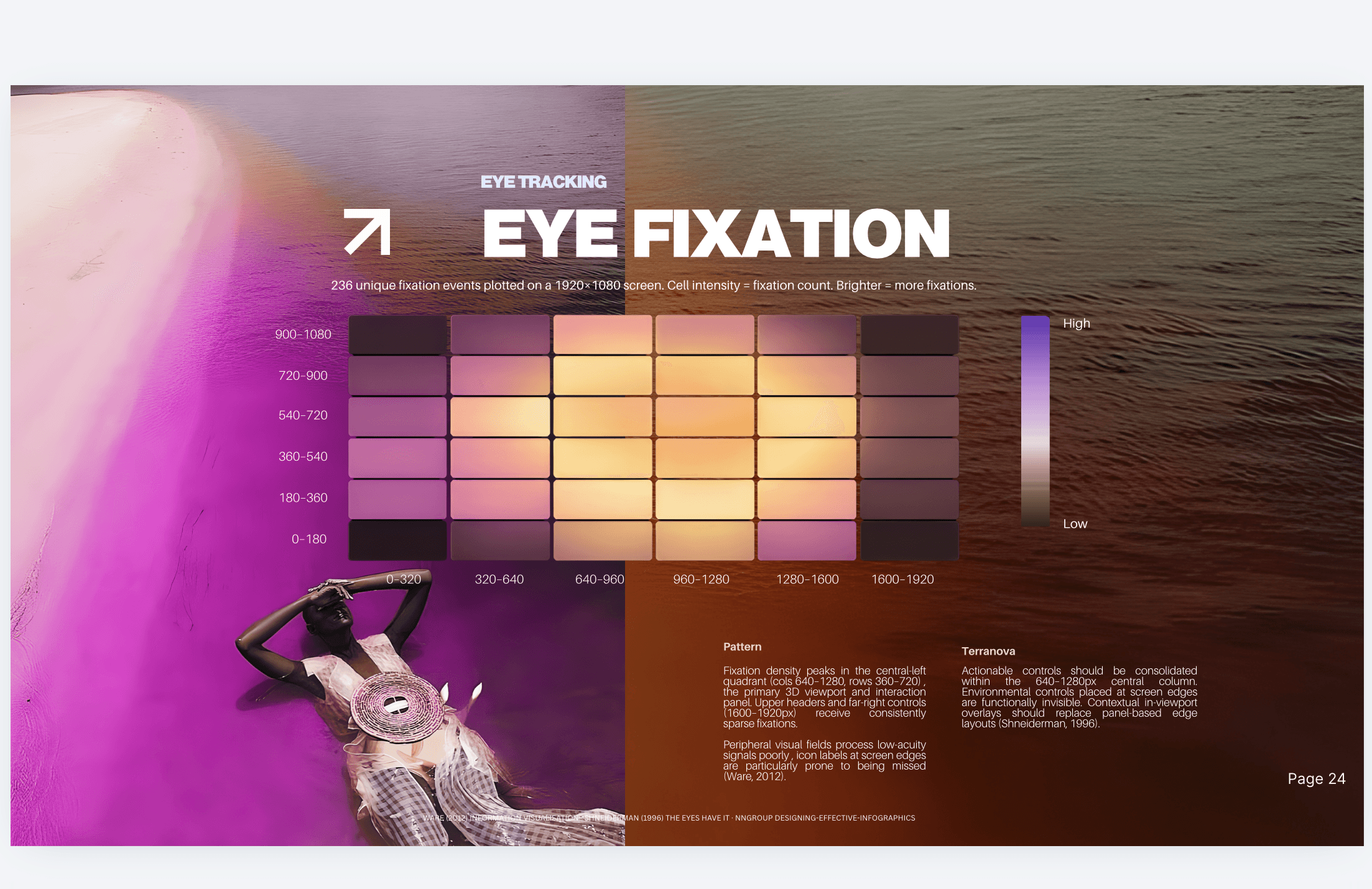
The 3D viewport and interaction panel drew the densest fixation, confirming the centralised workflow as the correct anchor.

Users scanned in a predictable order at first, then started hunting near the screen edges once they tried to finish the task.

Twenty to thirty seconds per task, with no failures: the prototype is usable on first contact.

Every participant found their bearings inside 500ms, and the fastest did it in 394 , that's the target to hold.

Ordered by severity, and all four resolve with labels and clearer feedback , no structural rework needed.

100% task success at 83.4/100 usability , comfortably above the 68-point SUS baseline, with a clear route to the 90 target.

The cues weren't distracting (2.60). What people wanted was to control them (4.00).

Three separate lenses, and they all landed on the same weak floorboard: navigation.
Video Walkthrough
©26
(©23)
We delivered custom Webflow and Framer projects while strengthening long term partnerships with ambitious brands.
(©23)
Video Walkthrough

(©24)
It starts with a question no one else was asking: what if architects could feel the air before they built it?

(©25)
Every rival tool does half the job: spatial or environmental, never both.

(©23)
Businesses with beautiful walkthroughs with zero airflow data; parametric graphs with zero embodiment.

(©24)
Three people would eventually stand in this space: the architect drowning in data, the engineer defending it, the client who just wants to believe it.

(©25)
Air and light can't be perceived on a page, so decisions get made blind.
(©26)
The interface visualises the invisible; the study does too , surfacing what architects can't tell you they're doing.

(©23)
I mapped myself against the discipline and found my best work in the gaps between labels.

(©24)
Nine design the building, six design the interface , and both ends of that were represented.
(©25)
87% believe spatial would help. 67% already find interpretation hard. The gap between those is the product.

(©26)
The friction isn't in the numbers. It's in the distance between the output and the space it describes.

(©23)
They design first, check performance later. That's not a workflow. That's a warning sign.

(©24)
A user meets a cue they can't read, walks around it until it makes sense, and ends up fluent in three modes of environmental data.

(©25)
Three independent sources point at the same three failures, spatial disconnection, cognitive overload, and technical language as a barrier to trust.

(©26)
"We usually design first, then check performance after" , the requirement is to break that order.
(©23)
We refined Mōno™ Studio’s visual identity and positioned the brand around clarity, minimalism, and precision. Our focus shifted toward high end digital experiences, blending strategy, design systems, and performance. We delivered custom Webflow and Framer projects while strengthening long term partnerships with ambitious brands.

(©24)
I sketched to find the order of operations, not the look. Layout comes later; sequence has to be right first.

(©25)
This is where progressive disclosure stopped being a principle and became a checkbox group.

(©26)
A design system derived from findings, not aesthetics , focal-region hierarchy, layered disclosure, and spatially anchored data.

(©26)
A design system derived from findings, not aesthetics , focal-region hierarchy, layered disclosure, and spatially anchored data.

(©26)
A design system derived from findings, not aesthetics , focal-region hierarchy, layered disclosure, and spatially anchored data.

(©26)
A design system derived from findings, not aesthetics , focal-region hierarchy, layered disclosure, and spatially anchored data.
(©26)
A design system derived from findings, not aesthetics , focal-region hierarchy, layered disclosure, and spatially anchored data.

(©23)
There's no dashboard here, only a sequence , the data doesn't sit on top of the space, it becomes it

(©24)
Gaze captures where friction occurs, think-aloud captures why, the survey quantifies what it cost.

(©25)
Attention mapped to the overlays and the central canvas, not to peripheral navigation: the disclosure hierarchy held under test.

(©26)
The 3D viewport and mode tabs dominated gaze , evidence the centralised workflow directed attention exactly where intended.

(©23)
High fixation and low saccade rates indicate cognitive engagement rather than visual search.
(©24)
The 3D viewport and interaction panel drew the densest fixation, confirming the centralised workflow as the correct anchor.

(©25)
Users scanned in a predictable order at first, then started hunting near the screen edges once they tried to finish the task.

(©26)
Twenty to thirty seconds per task, with no failures: the prototype is usable on first contact.

(©23)
Every participant found their bearings inside 500ms, and the fastest did it in 394 , that's the target to hold.

(©24)
Ordered by severity, and all four resolve with labels and clearer feedback , no structural rework needed.

(©25)
100% task success at 83.4/100 usability , comfortably above the 68 point SUS baseline, with a clear route to the 90 target.

(©26)
The cues weren't distracting (2.60). What people wanted was to control them (4.00).

(©23)
Three separate lenses, and they all landed on the same weak floorboard: navigation.
(©24)
We expanded our client portfolio internationally and introduced structured service packages to streamline collaboration. Mōno™ Studio completed multiple premium website launches with advanced interactions and performance optimization at the core. We invested heavily in workflow systems, improving delivery speed without compromising quality.
Video Walkthrough
(©25)
We scaled operations by collaborating with specialized designers and developers, enabling us to handle larger and more complex projects. The studio sharpened its positioning in luxury, tech, and innovation-driven sectors. We introduced refined design frameworks focused on conversion, storytelling.
©26
Terranova treats environmental data as something to stand inside, not read about , airflow, light, and acoustics embedded directly into the model, not translated from flat outputs. Its real innovation isn’t the VR, it’s the restraint: one layer at a time, confidence built into every cue, calm design that never competes with the space itself.
Year
2026
Figma Design
Figma Make
Miro
Tobii Eye Tracker
2026
Figma,
Miro
Claude
Tobii
Introduction
Terranova is an immersive VR interface designed to embed environmental data : airflow, light, and acoustics, directly into architectural models, replacing 2D heatmaps with spatial understanding architects can navigate through.
Terranova is an immersive VR interface designed to embed environmental data : airflow, light, and acoustics, directly into architectural models, replacing 2D heatmaps with spatial understanding architects can navigate through.
Terranova is an immersive VR interface designed to embed environmental data : airflow, light, and acoustics, directly into architectural models, replacing 2D heatmaps with spatial understanding architects can navigate through.
The Problem
Blind design: Architects judge airflow, light, and acoustics they can never actually see.
Late discovery: Simulation gets checked after the building's already designed, not before.
No spatial tool: Every competitor offers VR or environmental data. None offer both.
The Problem
Blind design: Architects judge airflow, light, and acoustics they can never actually see.
Late discovery: Simulation gets checked after the building's already designed, not before.
No spatial tool: Every competitor offers VR or environmental data. None offer both.
Outcome
chinenyé
©2026
Mean Task Time
Across all three tasks and five participants, with a two-second spread on the first task. Consistent times indicate the interface is learnable rather than guessable.
Mean Task Time
Across all three tasks and five participants, with a two-second spread on the first task. Consistent times indicate the interface is learnable rather than guessable.
Mean Task Time
Across all three tasks and five participants, with a two-second spread on the first task. Consistent times indicate the interface is learnable rather than guessable.
Usability Score
Task success: 5/5 usability participants completed all three prototype tasks with zero to one error each, achieving an average usability score of 83.4/100.
Usability Score
Task success: 5/5 usability participants completed all three prototype tasks with zero to one error each, achieving an average usability score of 83.4/100.
Usability Score
Task success: 5/5 usability participants completed all three prototype tasks with zero to one error each, achieving an average usability score of 83.4/100.
Participants
Nine of fifteen participants said they would integrate Terranova into their existing design workflow.
Participants
Nine of fifteen participants said they would integrate Terranova into their existing design workflow.
Participants
Nine of fifteen participants said they would integrate Terranova into their existing design workflow.
Wanted Proven & Built the research didn't inform the design, it specified it.
Evidence
87%wantedspatialvisualisation
87%wantedspatialvisualisation
67%struggletointerpretcurrenttools
67%struggletointerpretcurrenttools
10-40%ofprojectbudgetslosttolate,stagerevisions
10-40%ofprojectbudgetslosttolate,stagerevisions


Reflection
chinenyé
©2026
As a spatial UX designer who believes complex data should feel understood, not decoded.

The hard part wasn't the interface , it was designing for a space I couldn't sketch. Flat wireframes assume a screen edge VR doesn't have, so I had to relearn layout as depth and distance.
Eye tracking taught me the rest. Watching where architects actually looked, rather than where they said they looked, showed me how much of my confidence was guesswork. I test that assumption deliberately now.
Reflection
chinenyé
©2026
As a spatial UX designer who believes complex data should feel understood, not decoded.
The hard part wasn't the interface , it was designing for a space I couldn't sketch. Flat wireframes assume a screen edge VR doesn't have, so I had to relearn layout as depth and distance.
Eye tracking taught me the rest. Watching where architects actually looked, rather than where they said they looked, showed me how much of my confidence was guesswork. I test that assumption deliberately now.
Places I've worked
2020
Nerdwallet,
Product Design & User Research Intern
2019
Blueprint,
Product Design
2019
UC Berkeley Mobile App,
App Designer
2019
E*TRADE Financial,
UI/UX Design Intern
2019
Lendlease Group,
Construction Management Intern

Experience & Qualifications
My CV
Experience & Qualifications
My CV
Experience & Qualifications